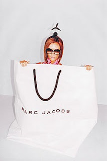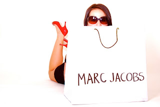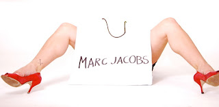


so here is my advertisement post...i had a few difficulties with the fact that my bag was not nearly as big as victoria beckham's...and the fact that it wasnt actually a marc jacobs bag at all, but a birthday bag covered in white paper. but hey, i think it worked.
i also think the lighting worked pretty well without the receiver to the big flashes in the studio. i used my nikon speedlight sb-28 flash, which worked pretty well for the typical marc jacobs look, which is pretty blown out and high on the white. this was a fun shoot!
(model credit: marlies woods)
I love the white outed looks of Marc Jacobs ads, and I think you did a great job with replicating these, despite the difficulties with the props. The only recommendation would be in the first picture, to maybe have your model look downward so we don't get that reflection in her glasses...but otherwise awesome job!
ReplyDelete~Caitlin
loves it.
ReplyDeleteespecially the high key quality
kirslyn
I love your choice of ad, it's really fun :) I think your second image is a smidge too blown out, but the first one is spot on. Great job.
ReplyDeletethese are fantastic. i love the bright white and slightly washed out effect, they're so similar to the real ads, i think you did a great job. i also love how bizarre the first picture is with the positioning of the head and foot. really disconcerting, but cool at the same time - alex
ReplyDeletehaha great job Kara! I love these pictures. I like how your model is not actually in the bag either. Cool! good job!
ReplyDeleteBresha